Pages

Sunday, 1 December 2013

My Property is My Pension (because of Leverage)

Within this great country of ours we have what appears to be an eye watering level of debt.  We learnt this week that household debt in the UK, including mortgage debt, has now grown to £1.43 trillion or £28,489 for every adult. We however need to be careful when digesting this type of information as what really matters for the Average Joe is actually Wealth which is the market value of all assets minus those debts.

The Office for National Statistics Wealth and Assets Survey, published on the 12 July 2012, tells us that the total Wealth (including private pension wealth but excluding state pension wealth) of all private households in Great Britain was £10.3 trillion.  That’s £373,000 of wealth for the Average Household and even if we switch to Median values, to try and remove some of the extreme Wealth held by the 1%, it’s still £210,000, making the debt seem a little less serious on the average (I acknowledge that the poorest probably have no wealth and a lot of debt with the richest having lots of wealth and little debt but that’s for another day).  32.9% of this wealth is Net Property Wealth which is the value of the property held minus the value of mortgage liabilities and equity release.  Not everyone is lucky enough to own a property but for those that do the Average Net Property Wealth is £195,000 and the Median is £148,000.

With so much Wealth tied up in Property it’s no wonder I still hear and read of people using the My House is My Pension statement.  This is in my humble opinion is a statement from someone who really hasn’t quite understood how they have generated all that housing Wealth they now possess.  Have they really stopped to understand how with average earnings of £474 per week and a property Compound Annual Growth Rate of 5.4% since January 1995 (Land Registry data) so much Wealth has been generated by property.  There are of course a number of ways this has occurred including the more obvious time in the market and riding the rapid rise in property values between the mid 90’s and 2007 but there is also another method that all those with a mortgage are employing which I don’t think the vast majority even understand.  This is Leverage or Gearing which is a financial technique used to increase gains or losses by giving the investor the return on a larger capital base than the investment personally made by the investor.  In home owning speak the investment is the house deposit and the capital base is the purchase price of the house.  The leverage is achieved by taking on a mortgage.

Sunday, 17 November 2013

How to Become a Millionaire

Two thoughts:
  • In life we all behave differently and have different aspirations.  As long as harm is not being done to others then this is ok and is what keeps the place interesting.  This means that there will be people who have opted out of consumerism and are practising limited frugality such as myself (and many readers) and people who are consuming either through choice or because they are just not aware of the alternatives.  That’s ok.  There will also be people like myself (and many readers) who have personal finance as a hobby and others who either have no interest in the subject or struggle with too much mathematical complexity.  That’s ok also.  I sometimes wonder what those of the opposite persuasion must think when they stumble across Retirement Investing Today via Google or other website link.  I can’t help but wonder if we might be perceived as a little extreme and also guilty of making personal finance topics unnecessarily complicated.  For this post I therefore want to take a step back and not be either extreme or complex to hopefully help many.
  • A Million Pounds is a lot of wealth to all but a very few.  It is also a very emotive value.  Could anybody who was prepared to apply themselves in life, but not be as extreme (maybe they gain happiness from things or want more work/life balance or...) and analytical as we are on this blog ever accrue a million pounds?  Let’s try and develop a simple model to demonstrate if an Average Joe could become a Millionaire.

Let’s define our Average Joe.  I’m going to assume our Joe is not an “Average Earner” but instead intends to pursue a “profession” which will start on a salary of £20,000 at age 21 and finish on a salary of £40,000 at age 68 (State Pension Age for today’s young), for an average lifetime earnings of £30,000.  I can think of many arts, sciences or technical university/apprenticeship routes that would enable this level of attainment through persistence.  Our Average Joe also doesn’t aspire to the 60% savings rates that I do but does realise its important and so religiously saves 20% of earnings every month leaving plenty of cash for consumption today.

Thursday, 14 November 2013

What Would I Do if I Fell On Hard Times (and Importantly How Would I Recover)

It’s been a surreal week.  Midway through it I received a phone call from a good friend who has just returned from the third family holiday of the year.  However this time instead of talk of how great the holiday was I was greeted with an “I'm in financial difficulty and could I borrow some money from you?”  A little clarification revealed we weren't talking about twenty quid until next payday but thousands of pounds.  I was dumbstruck.  Why?

My friend is intelligent, has a very similar educational background to my own and has been working a similar amount of time.  We have similar jobs, albeit at different companies, but I would guess our salaries are probably within 10% of each others.  We do however live very different lifestyles.  To give some examples:
  • In my friend’s family only 1 of them works.  In my family 2 of us choose to work.  
  • My friend’s family chooses to live in a lovely part of London in a very nice rented house.  I live with my family in a small rented flat in a less salubrious part of town which is actually perfectly adequate for or needs.
  • That lovely house above is not well insulated and so already has the heating on where I'm still yet to even consider it.
  • My friend’s family choose to holiday at least 3 times per year.  My family has a single holiday each year along with a family visit for Christmas.
  • My friend’s family is always dressed like they've just walked off a catwalk.  My family while wearing clean, neatly pressed clothes are a little out of fashion and contain the odd darned sock.

I must be clear here.  I don’t begrudge my friend’s family any of the above.  Everyone in this world is entitled to live their own lives and make their own choices.  I've chosen to Save Hard, Invest Wisely and Retire Early which today means I have accrued 72% of the wealth I need to secure financial independence.  My friend’s family has chosen to live for today.  I’d never really thought about the differences between us previously but when you look at the differences above we are at very different stages in life and on a very different life path.  The now clear disparity in wealth really did bring the book The Millionaire Next Door by Thomas Stanley into the forefront of my mind.  The only difference is that I don’t have a million pounds nor do I think I will need that much for financial independence as I've found plenty of ways to live well while spending less.

Sunday, 3 November 2013

Valuing the FTSE 100 - November 2013

A quick glance at one of the many FTSE100 charts published by the mainstream media might start to get the average punter a little excited.

Chart of the FTSE 100 Price
Click to enlarge, Source: Yahoo Finance

Why?  Well, with the market closing at 6,735 on Friday we have now passed the previous nominal 15 June 2007 high of 6,732 following which the market proceeded to fall 48%.  We are also now only 2.8% from the nominal 30 December 1999 record high of 6,930 after which we saw falls of 52.6%.

A FTSE 100 Price of 6,732 also has us up 4.3% when compared with the 01 October 2013 Price of 6,460.  We are also up 14.9% year on year.

Am I getting excited?  In short, no.  This is for a few reasons:

  • The most important is that my investment strategy is no longer based on any form of emotion but is instead purely mechanical.  Once I made this move I found very quickly that all emotion, whether that be pessimism or optimism, when it came to economic or market news drained from me.
  • As I’ll show in this post I don’t believe that the market is actually anywhere near a new high.
  • Again, as I’ll show in this post, while I believe the market is partially overvalued it’s still only in the bottom 16% of monthly valuations since 1993.   


Let’s now run the numbers.  The last time we looked at this dataset was on the 26 June 2013.

Let’s firstly remove some of excitement by:

  • Correcting the chart for the devaluation of the £ through inflation.  For this dataset I use the Consumer Price Index (CPI) to devalue the £.
  • Plotting the Pricing on a logarithmic scale as opposed to a linear one.  By using this scale percentage changes in price appear the same.  


Looking at the chart this way reveals the FTSE 100 in a very different light.  That light shows that Friday’s FTSE 100 Price is actually still 27% below the Real high of 9,273 seen in October 2000.  We’re also still 17% below the last Real cycle high of 8,084 seen in June 2007.

Chart of the Real FTSE100 Price
Click to enlarge

Wednesday, 30 October 2013

Birthday Greetings, Bottle of Wine (+ Strategy Defined Adjustments)

I’m not quite 64, for those who picked up on the song lyric reference within the post title, but I have just recently aged another year and now enter my 42nd year.  This requires two adjustments to my portfolio, as defined by the Retirement Investing Today Low Charge Strategy, which was first published in December 2009 and later refined in September 2012.

Target Retirement Income

Back in 2007 after plenty of research I set myself an income that I wanted in early retirement.  That number is greater than I need to live and leaves room for some enjoyment given I could be in retirement for a longer period than I have already been alive.  This became my Planned Income.  From this I could then calculate the amount of wealth I had to acquire through Saving Hard and Investing Wisely by taking this number and dividing it by my Safe Withdrawal Rate (SWR).

With the Low Charge Strategy defined which includes my savings rate, asset allocations and predicted returns from those asset allocations, plus armed with a Planned Income and SWR I was able to build an Excel model that predicts my retirement date based on the future being “average”.  I prefer to think in today’s money, rather than devalued by inflation future money, and so all of the calculations are based in Real (ie inflation adjusted) terms.

Obviously, we live in an inflation based society and so every year I need to increase that 2007 income by a cost of living adjustment to account for inflation over the past year.  Back in 2007 I decided that adjustment would be the Retail Prices Index (RPI).  The chart below tells me that my retirement “annual pay” is increasing at a much greater rate than the average punter out there but for me the model seems to be realistic as my retirement date has hardly moved since 2007.  When I started the blog in November 2009 I predicted 7 years until retirement (work becomes optional) and today I’m predicting that the day will appear some 2.5 years  putting me ahead of the game at this time.

Average Weekly Earnings (KAB9) Annual Change vs RPI
Click to enlarge

Uprating my planned income results in a decrease in my progress to retirement given the formula:

Monday, 28 October 2013

Responding to Risk with Intelligent Analytics

By Joe Budden

Following the financial crisis of 2007-2008, many veteran traders were faced with a totally different financial landscape in which to operate. The ‘New Normal’, a term first coined by Pimco trader, Mohammed El-Erian, became the finance community’s go-to word for a new world order which bore more similarities with the post Depression era than anything investors had previously experienced.

This ‘New Normal’, characterised by persistently sluggish growth, high unemployment and political wranglings over debt ceilings and budget deficits, is now five years on and shows no sign of abating.
But it is not only political parties that stand to lose from this new period of economic stagnation.
Financial markets, as a result of huge injections of artificial liquidity from central banks, now reside atop a mountain of debt and are precariously placed should we see any reduction in liquidity or future drop in growth.

Indeed, it could be argued that the super loose monetary policy used in response to the biggest recession since the 1930’s has actually heightened risk, and the resultant artificial rally in global stock markets has created a world in which markets are now scarily dependent on the money flows from central banks.

Much like an addict becomes dependent upon a drug, the financial markets have become dependent on the monthly injections of quantitative easing from the Federal Reserve, and it is for this reason that every FOMC meeting is now watched with baited breath by most traders.
And just like the symptoms of withdrawal when such a drug is taken away, the potential for significant market volatility is profound and something that every investor and trader should be prepared for.

The next shock to the system: Inflation

At the heart of the problem financial markets face is a battle between stagnant economic growth and the coming onslaught of inflation, brought on by years of easy money. Normally this would not present too much of a problem since periods of economic stagnation can be easily prodded into life by central bank intervention.

However, to believe this is to forget that the central banks have now used up all of their bullets. Indeed, central banks now sit on a mountain of debt with no alternative but to scale back, or ‘taper’ as the Fed like to call it - rhetoric that has already caused significant turmoil in stock markets over the last couple of months.

And with the prospect of future unwinding, the already fragile growth picture seen in most developed nations, has the potential to stall even further. (Indeed, recessions typically occur every 4-6 years in developed countries meaning we are now overdue.)

Wednesday, 23 October 2013

A Method to Help Us All Save More

The road to wealth creation, which leads to financial independence if persisted with, is no secret.  In fact P. T. Barnum in his 1880 publication, The Art of Money Getting (available for free in Kindle Edition at the link), which is still as relevant today as when it was first published, reveals it by the second paragraph.  “Those who really desire to attain an independence, have only to set their minds upon it, and adopt the proper means, as they do in regard to any other object which they wish to accomplish, and the thing is easily done.  But however easy it may be found to make money, I have no doubt many of my hearers will agree it is the most difficult thing in the world to keep it.  The road to wealth is, as Dr Franklin truly says, “as plain as the road to the mill.”  It consists simply in expending less than we earn; that seems to be a very simply problem.  Mr Micawber, one of those happy creations of the genial Dickens, puts the case in a strong light when he says that to have an annual income of twenty pounds per annum, and spend twenty ponds and sixpence, is to be the most miserable of men; whereas to have an income of only twenty pounds, and spend but nineteen pounds and sixpence is to be the happiest of mortals.”

If “those who really desire to attain an independence, have only to set their minds upon it” and spend less than we earn I ask how do we find ourselves in a world some 133 years later where every 5 minutes and 7 seconds someone is declared insolvent or bankrupt and the average household debt in the UK (excluding mortgages) is £6,020?  Why is it “the most difficult thing in the world to keep it”?  While we shouldn't trivialise this as there likely many reasons depending on who you are, which includes some people who through no fault of their own fall on hard times, I also can’t help think of two major reasons which likely prevent the road to wealth from being found for many.  The first is that in the modern day a lot of people refuse to take responsibility for their own actions but instead prefer to act like a victim.  The second is education.

If nobody shows you where that needle in the haystack is then probability says you won’t find it.  The problem is in modern society who has it in their interest to show you where the needle is?  Of course the individual does but if they never know they are looking for it then it’s down to luck to stumble across it.  Family and friends possibly do but it relies on them having found the needle for themselves.  Worse it is actually in the rest of the world’s interest for you not to find the needle.  All those advertisements you are bombarded with day and night whether direct or more subtly via the current lazy mainstream media certainly don’t want you to discover it.  They want you spending “twenty pounds and sixpence” and not “nineteen pounds and sixpence”.

Let’s therefore make this post a needle in the internet haystack and hope that some find it.  If you’re reading this then feel free to Like or Tweet it, as every one of those places another needle in the haystack that might be found.  Let’s detail the simple method that helps me save more.

Step 1: Prepare a Budget

A budget is no secret and I’m sure 99.9% of the population is already aware of what a budget is.  Just about every personal financial site and book talks about them.  While well known they unfortunately don’t give you any answers but they do give you information.  They won’t help you save more but are a necessary first step as they:

  • let you take a step back to see what the situation looks like;
  • tell you how quickly you need to act; and
  • tell where you should focus first.


If your budget shows you spending “twenty pounds and sixpence” then you clearly have an emergency on your hands.  Every second that passes is seeing you move further into debt which is then making it more difficult to ever get out of it.  Mr Money Mustache ‘eloquently’ advises that in this situation the correct response is to treat it like “there is a cloud of killer bees covering every square inch of my body and stinging me constantly!!!!  I need to stop it before I am killed!!!”  In this situation you need to get yourself to the point of only spending “nineteen pounds and sixpence” quickly.

Saturday, 19 October 2013

No Record High for UK House Prices, says RIT

UK house prices rose to a new high in August, according to the Office for National Statistics (ONS)” reports the BBC.  “House prices in August were 3.8 per cent higher than the previous year at £247,000 - topping the previous all-time high recorded in January 2008, according to the Office for National Statistics” reports The Telegraph.  “Average house prices in the UK leapt to a record high of almost £250,000 during the summer” reports The Times.  Sometimes I really do despair.  Is there no decent journalism left in this great country of ours?  Before we even get into this posts content let’s be clear.  A new house price high has not been hit.  The last high was back in 2007 and we are nowhere near that today.  Let’s now run the numbers to prove it.

Firstly it’s important to understand that there are a multitude of UK House Price Indices out there with every one of them measuring something different.  I track five of them:

  • The Rightmove House Price Index.  It calculates its house price by simply taking the Arithmetic Mean or Average asking price of properties as they come onto the market.  This means it will be affected by price changes, if the mix of house type changes and if the mix of location changes for houses coming onto the market.  It is not seasonally adjusted and covers properties from England and Wales.  So this index really doesn’t track house prices as no purchase is required for it to appear within the index making it pretty much worthless.  I only use it as a possible leading indicator (see below).
  • The Acadametrics House Price Index.  This index uses the Land Registry dataset but in a different way.  It calculates its house price by taking the Arithmetic Mean or Average of bought prices.  It then mix adjusts the data to take a constant proportion of property types, from a constant mix of geographic areas.  It is seasonally adjusted and covers properties from England and Wales.  It covers buyers using both cash and mortgages.  
  • The Halifax House Price Index.  This index is based on buying prices of houses where loan approvals are agreed by Halifax Bank of Scotland.  It uses hedonic regression to remove type and mix variations thereby measuring the price of a standardised house.  I use the non seasonally adjusted dataset and it covers the complete United Kingdom.  
  • The Nationwide House Price Index.  This index is very similar to that of the Halifax except it is based on buying prices of houses where loan approvals are agreed by Nationwide.  
  • The Land Registry House Price Index.  This index uses repeat sales regression on houses which have been sold more than once to calculate an increase or decrease.  As it analyses each house and compares the latest buying price to the previous buying price it is by definition mix adjusting its data also.  This is then combined with a Geometric Mean price which was taken in April 2000 to calculate the index.  It is seasonally adjusted and covers properties from England and Wales.  It covers buyers using both cash and mortgages.  


To use these indices we must also remember there is a timing shift between the indices.  Firstly, a house is placed on the market for the first time (the Rightmove Index).  Secondly, somebody possibly buys the house using a mortgage (the Nationwide and Halifax Index).  Finally, the purchase is registered with the Land Registry (the Land Registry and Academetrics).  The best estimate of this timing shift is shown in the chart within the paper by Robert Wood entitled A Comparison of UK Residential House Price Indices.

Let’s apply this timing shift, place all of the indices onto a chart and look at what we have.

House Prices according to Rightmove, Nationwide, Halifax, Land Registry and Academetrics
Click to enlarge  

The Nationwide, Halifax and Academetrics, while showing a recent uptick, are all nowhere near record highs.  The Rightmove Index suggests a record high was reached in August and Academetrics shows we have just seen one.  The argument is flawed though because all of these indices are measured in a currency which is being continually devalued through inflation and so is not a constant.  Let’s therefore correct for that and have another look.

Real House Prices according to Rightmove, Nationwide, Halifax, Land Registry and Academetrics
Click to enlarge  

That looks pretty compelling to me.  UK House Prices are nowhere near a new high.

Tuesday, 15 October 2013

Using a Credit Card to Save Hard (+ UK Average Weekly Earnings)

The Office for National Statistics reports that the Average (Gross, before tax) Weekly Earnings of those that choose to work in this great country of ours is rising by 0.6% per annum.  David Cameron might even spin this into a demonstration that Strivers are starting to get ahead but we have plenty of more work to do if we are to lock in the recovery.  Of course nothing is further from the truth as while that increase has taken place our “strivers” purchasing power has been reduced by 3.1% through inflation (RPI).  This means that on the average all those “strivers” out there have actually taken a gross pay cut of 2.5%.

This is not a new phenomenon.  Real (post inflation)Gross Earnings have been falling for a number of years now.  This can be seen in the chart below which takes the average weekly earnings, multiplies these earnings by 52 weeks to get an annual figure and then corrects for currency devaluation caused by inflation.

Index of UK Whole Economy Average Weekly Earnings Corrected for the Retail Prices Index (RPI)
Click to enlarge

If you’re a “striver” you’re probably thinking this all looks a little bad but it’s actually worse than this.  We all know our politicians continually like to make promises they (we?) can’t afford and love to waste our money on pet follies but don’t like to tell us what that all really costs.  So to hide some of the cost they use that inflation to their advantage by combining it with our Progressive Tax system and Fiscal Drag to tax us more without having to even tell us.

Let’s demonstrate with an example.  Our average “striver” was earning a gross £471 per week and was then given that 0.6% annual increase taking his earnings to £474 per week.  Using a PAYE Tax Calculator we can see our “striver” has seen his net (after tax and national insurance) earnings rise from £374.47 to £376.51.  So as far as the “striver” is concerned it’s not an increase of 0.6% at all but actually 0.5%.  After correcting for inflation the pay cut is then actually 2.6%.

Sunday, 13 October 2013

A Retirement Investing Today Review 9 Months into 2013

This is the regular quarterly feature that demonstrates the progress a person living the tools and techniques that this site details can make towards early financial independence.  It is important to note that unlike many books or other websites out there this feature is not a simulation or model.  It is my life so you can say I have plenty of skin in the game and a big incentive to get it right.

This site is all about Save Hard, Invest Wisely, Retire Early so as with the 2012 Review let’s continue to use those 6 words as a theme.

SAVE HARD

I am now into a sixth year of aiming to save 60% of my earnings, which I define as my gross (ie before tax) earnings plus any employee pension contributions.  The game is all about finding ways to Earn More and Spend Less with the difference between the two being the Save Hard that can be put to work within my investment portfolio.

During my first few years it was all about getting to that 60% savings rate but having achieved it the real challenge now is to stay there.  It really is starting to become difficult to maintain that savings position.  The main reason for this is that I measure my savings rate against gross income and I'm a 40% taxpayer.  This means that if I get a pay rise to even partially compensate for inflation I have to save all of it to keep to the 60% savings rate.  This is because of the stealth tax practised in this country known as fiscal drag which doesn't up rate tax brackets with inflation.  I therefore have to continually find ways to offset 100% of the inevitable inflation in my spending which given the current economic climate I'm sure you will agree is difficult.  Let me give just 2 simple examples, which I’ll likely expand on in subsequent posts:

  • This week we've had the announcement that SSE is to raise gas and electricity prices by 8.2%.  Last year I only used my central heating for about 4 hours so I have already minimised the elephant in the room for most people.  On top of that I still need to cook meals as it’s cheaper than eating out plus have the lights on when it’s dark but already use energy efficient bulbs (and only have the light on in the room that I am using).  Where do I go next?  Note I have a vested interest here as energy price rises hurt me but I own SSE in my HYP so I also want them to maximise profits.
  • To maximise both my better half and my savings I choose to commute a long distance to work which means I burn quite a lot of fuel and we all know fuel prices are rising.  I'm already using a fuel efficient car and always ensure tyres are correctly inflated, I'm carrying no excess weight plus have developed a very light right foot combined with the ability to coast rather than brake.  Where do I go next?  Here I actually have some ideas.  They seem to be working but I want to ensure they are sustainable before I post about them.  


Year to date my savings rate is still above target at 61%.  This might sound like I'm meeting target but I see trouble ahead given that in quarter 1 the rate was 67% and in half 1 it had slipped to 64%.  The problems are all coming from my good friends HMRC.  As I detailed 3 months ago HMRC made a large mistake which resulted in an underpayment of tax which they are now collecting but having now just lodged my tax Self Assessment I can see there is further trouble ahead.  This is coming from the fact that my net wealth is now a not inconsiderable sum with 32% of it not being tax efficiently invested (not in a SIPP, ISA or NS&I Index Linked Savings Certificate).  This means my annual tax bill on those investments is also now not inconsiderable.  By the time the underpayment is recovered and I've paid tax on those investments I can easily see my savings rate falling into the low 50%’s by year end.

Saving hard 9 months in score: Conceded Pass. Ok for now but definite trouble ahead.

Saturday, 5 October 2013

Give Me the Dividends Mr CEO (Valuing the Australian Stock Market)

As a stock market investor there are only 2 ways for your wealth will grow – share price appreciation and the reinvestment of dividends which are also hopefully appreciating on a per share basis.  How do CEO’s achieve this share and dividend per share appreciation for us?  I see two distinct methods.  The first is what I like to see and includes:

  • funding of focused and targeted R&D to generate new products with unique selling points when compared to the competition allowing market share gain;
  • looking for new white spaces in the global market where products can be sold; and
  • tirelessly working to find operational efficiencies which increase profitability for a given amount of earnings, to name but three.

The second method I'm not so keen on and includes:

  • the merger and acquisition (M&A) of companies that supposedly have “synergies”.  Sure, some acquisitions work resulting in 1+1=3 but “study after study” also “puts the failure rate of mergers and acquisitions somewhere between 70% and 90%”.
  • share buy backs.  Maybe I'm being cynical here but why do I believe CEO’s undertake share buy backs?  I believe it’s to boost Earnings per Share and the Share Price.  Now why would they want to boost those?  A lot of Executive bonuses are based improving metrics such as these including straight up cash incentives but more stealthily through incentives like share options.


What would I prefer to see from CEO’s?  If they are out of ideas on how to grow the top and bottom lines organically then give the profits back to me in the form of dividends.  Unlike the CEO I can then reinvest those dividends across the whole market if trackers are my thing or a completely different sector if I think that one is overvalued in any world location.  This gives me an advantage over the CEO who only has his/her own company or “synergistic” companies to choose from.

Give Me the Dividends Mr CEO

It’s not a perfect science, because issues like company and shareholder taxation get in the way which/do cause forced behaviours/distortions, but if we look at the ratio of dividend yield to earnings yield we might be able to get some idea of which countries CEO’s are trusting the shareholder and which are having delusions of grandeur and trying to line their own pockets.  Today the S&P500 has a dividend yield of 2.0% and an earnings yield of 5.7% for a ratio of 0.35 meaning US CEO’s are only giving the owners of their company’s 35% of company earnings.  In contrast the FTSE100 is offering a dividend yield of 3.6% (80% more than the US) and an earnings yield of 6.7% for a ratio of 0.54.  So FTSE100 CEO’s are giving back 54% of earnings.  Now let’s jump to another developed country with a relatively small population – Australia.  The ASX200 today has a dividend yield of 4.3% (19% more than the UK and 115% more than the US) and an earnings yield of 5.6% (pretty much identical to the US) for a ratio of 0.77 or 77% of earnings being returned to shareholders.  A visual representation of this can be seen in the chart below.

Chart of S&P500, ASX200 and FTSE100 Dividend and Earnings Yields
Click to enlarge

This method doesn’t claim to be perfect and I could write a page of caveats as to why but it does give some food for thought and further analysis.  One of which is that the reason the return to shareholders is so large in Australia is because Earnings are falling while CEO’s naively maintain (or increase) dividend payments.  Let’s therefore step away from the method and analyse whether the Australian Share Market is good value.

Sunday, 8 September 2013

Do Retained Earnings find their way to the Shareholders via Share Price Growth

Running this site brings a number of benefits.  To continually provide original content it forces me to continuously research beyond that of the mainstream media, which I find generally contains a lot of vested interests.  It also keeps me accountable to my original Retirement Investing Today philosophy.  If I can’t walk the Save Hard and Invest Wisely for Early Retirement line then how can I expect others to consider following my footsteps, after having done their own research, when I’m not living what I preach.  Yet so often amongst the world of “experts” we see just that.

Let me give a very simple example.  I’m generally a fan of The Motley Fool, particularly the forums, however take some time to read These Savvy Investors Have Just Hit The Jackpot which I thought would be relevant given I added Vodafone to my HYP back in December 2012.  Besides the article being full of errors it was the last sentence that really did it for me – “Maynard does not own any share mentioned in this article.  The Motley Fool has recommended shares in Vodafone and GlaxoSmithKline”.  So somebody is prepared to write an article about how great something is but isn’t prepared to put any of his own skin in the game.  That’s certainly not how this site works.

The negative of my approach is that you the reader generally only ever see one viewpoint, which is my life.  Of course the much valued Comments provide different viewpoints which benefit everyone but I also get an additional benefit, email from readers, which is what today’s post is all about.  A couple of weeks back I received a well thought out email which used some of the regular data that I publish on this site but which was used to answer a different question to that which we usually look at.  Some of the conclusions were also slightly contrarian.  After some email banter that reader has generously allowed me to publish that email.  I hope you enjoy the different viewpoint.   

"
Dear RIT

The big question - Do retained earnings find their way to the shareholders via share price growth?

After a lucky run in business I retired 5 years ago aged 40.  As only a third of my portfolio earnings are paid out as a dividend I have been searching for an answer to this big question.
I came across your FTSE 100 Cyclically Adjusted Price Earnings Ratio (FTSE 100 CAPE) Update post and I'm certain the answer is in there but you need to look at the data slightly differently. Please stay with me as you will love the outcome.

Wednesday, 4 September 2013

Use Technology for Early Retirement and Not to Extend Wage Slavery

Looking back over my short 40 and a bit years, technology and access to it really has exploded.  Thinking about technology a little deeper though and I start to wonder whether the majority of people really are using it or whether it’s actually using them.  Let’s look at a few examples.

Credit cards may not be a technology in the strictest sense of the word but technology advancement sure has helped make them an everyday item.  It’s debatable as to who or what was the first credit card, but roll the year to 1951 when 200 pre-approved persons were able to present a Diner’s Club card at 27 New York restaurants and you have something that sounds pretty close to what we have today.  Except even in my “early” years, some 30 years or so post 1951, I remember my parents not even possessing a credit card but instead choosing the debt free alternative, layaway or lay-by.  Fast forward to today and it’s rare to find somebody who doesn't possess a credit card.  Unfortunately this great convenience seems to have been used by the majority to bring forward consumption by piling on debt at the expense of either larger consumption later or earlier retirement.  Instead let me demonstrate how I use my credit card (yes I have a credit card and also save 60% of gross earnings).  I buy everything I need (of course my definition of need is very different to that of many) on credit card knowing that I have the money in the bank.  I get the item now but depending on when in the month I make the purchase I don’t have to stump up the cash, which automatically happens via direct debit, for between 1 and 2 months.  Over that period that money is earning interest for me, adding to my wealth and bringing retirement that little bit closer.

I remember my first computer, which also came in the 1980’s.  It was an IBM XT clone desktop with a processor capable of 4.33MHz and a ‘turbo’ button which pushed that to something like 10MHz.  It had a 20MB hard drive, a CGA monitor and two 5 ¼” (remember those?) floppy disk drives.  It certainly didn’t have a microphone or a camera and in hindsight it did very little to better my life.  Today we have Smartphone’s, Tablet’s and Laptop’s with multiple GHz processors, 100’s of GB (if not TB) hard drives and high definition screens.  Combine that with the internet which was still in its infancy in the late 1980’s and the opportunities to create extra wealth are today nearly endless.  The majority of people just don’t see or don’t want to see the opportunities. Let’s look at a few.

Monday, 2 September 2013

Buying Gold Tax Efficiently

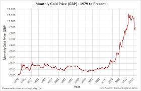
Kitco tells me that Gold when priced in USD’s closed on Friday at a nominal $1,395.50.  Convert that into GBP’s and you’re looking at a Nominal Gold Price of £899.35.  Staying in Sterling that is a Nominal Gold month on month price rise of 6.1% and a year on year price fall of 13.1%.  The chart below shows the Nominal Monthly Gold Price in £’s since 1979.

Monthly Gold Prices in £’s
Click to enlarge

If we then adjust this Gold chart for the continual devaluation of Sterling through inflation we can see Real Gold Prices which are shown in the chart below.  If this is of particular interest then you might also be interested in understanding if Gold can protect UK Investors from inflation.  The key Real Monthly Gold Price metrics are:

  • Real Gold Peak Price was £1,196.28 in January 1980.  At £899.35 we are 24.8% below that peak today.
  • The long run Real average is £544.05 which is therefore still indicating a very large potential overvaluation.
  • The trendline indicates the Real Gold Price should today be £515.36 which would indicate even further overvaluation.  

Real Monthly Gold Prices in £’s
Click to enlarge

Saturday, 31 August 2013

Should I put my UK Pension into Income Drawdown or Buy an Annuity

As I sit here, as a late 40 year old, writing this post 41% of my wealth is held within pension wrappers including a very healthy SIPP.  If I stay the course with my Investment Strategy then Early Retirement will likely appear around age 44.  Running a forecast to that age, which looks at my intended contribution profile and expected portfolio diversification into both the pension and non-pension assets, would result in 44% of my wealth being within pensions at that point.  This is of course only going to be true if the my investments perform on average over that period which of course is a big if but is all I have to use for forecasting.

If I then continue with the Transition to Retirement Strategy which includes the purchase of a home for my family and includes rapid pay down of the mortgage in the 11 or so years until I can access my pension assets then my pension wealth will rise quickly as a percentage of total wealth.  This is because my non-pension assets will need to generate my salary as well as pay down the mortgage while the pension continues to grow in value from investment return.  To demonstrate the severity of this if I step my retirement forward 10 years to age 54 my pension wealth could be as high as 83% of my total wealth.  This excludes any equity which I will have in the family home which might frustrate The Investor over at the excellent Monevator somewhat.  That’s a lot of wealth tied up in a wrapper that has a track record of being tinkered with by government.  What’s also interesting is that as I leave the early retirement phase of my life and become a typical retiree my position is probably not that much different to most people who have saved in a pension for a typical retirement.

Step forward 1 year to 55 and it all gets interesting, at least under current pension rules, as I can now start to access my pensions.  The no brainer for me is that I’ll firstly take the 25% tax free lump which in line with the Transition to Retirement Strategy will be used to pay off the mortgage, maximise that years ISA contribution and invest the remainder as tax efficiently as possible.  At that point my forecast suggests around 75% of my total wealth is now within the pension.

Unless I’ve missed a trick I believe I now have essentially two options if I want to generate an income from the remaining pension pot.  I can put the pension into Income Drawdown or alternatively buy an Annuity.  Let’s look at the Pro’s and Con’s of each option plus run an example for each option based on my situation assuming I was 55 today.

Sunday, 11 August 2013

The S&P 500 Cyclically Adjusted Price Earnings Ratio (S&P500 CAPE) Update - August 2013

This is the monthly review of the S&P500 including a couple of S&P 500 valuation metrics.  The last review can be found here.

S&P500 Price

At market close on Friday the S&P500 was Priced at 1,691.  That is a rise of 1.4% when compared with 1,669, which is the average closing Price of each trading day last month.  It is 20.5% above last year’s August monthly Price of 1,403.  Note that for this index I only look at monthly average Prices as opposed to hourly or daily as I’m a very long term investor and just don’t need the noise associated with more granularity.  I’ll leave that for the traders out there.

We can then look at how this Price compares to history which is shown in the chart below.

Chart of the Monthly S&P500 Price
Click to enlarge

This is a similar chart to that which you will see in many places within the mainstream media when displayed over a long term.  It looks sensational and in my opinion isn’t very helpful.  Let’s therefore adjust it to the chart below where I try to show what is really going on with Prices.  I make two adjustments:

  • Correct the chart for the devaluation of the US Dollar through inflation.  
  • Show the Pricing on a logarithmic scale as opposed to a linear one.  By using this scale percentage changes in price appear the same.  For example let’s say we have two historic prices of 10 and 100.  If they both increase in price by 10% then they increase by 1 and 10 respectively.  On a linear scale it would appear as though the second has increased by a factor of 10 more than the first where on a logarithmic scale they will appear to have changes the same.  Less sensational but more correct. 


Chart of the Monthly Real S&P500 Price
Click to enlarge

Thursday, 8 August 2013

Now I’m Being Asked to Encourage My Own Rent Increases

I have little tolerance of the Assured Shorthold Tenancy (AST) process which is nothing short of a scurge in this great country of ours.  Having now just completed my annual AST dance which goes something like:

  1. An email is received from the “Property Manager” of the Local Lettings Agent.  “Dear RIT.  Your current AST is due to expire.  Therefore if you want to stay in your current rental accommodation it’s time to renew.  The Landlord is looking to increase the rent by (insert a large random number based on no facts here).  Additionally we will be looking to extort a renewal fee of (insert a smaller random number again based on no facts here).”  I know they are also taking at least 12% of every month’s rent from my Landlord as they are so incompetent that they have occasionally sent me the Landlords monthly Statement so I’m assuming they’re also extorting renewal fees from that direction as well.
  2. I then do some research and find out what rentals of a similar type as mine are going for in my area.
  3. I send an email in reply which goes something like.  “Dear Property Manager.  Having now conducted local market rental price research for similar properties and in recognition of our long standing respect for the property which keeps the Landlords costs down (which I know all your tenants can’t claim) plus an untarnished record of continued on time payment of rent (which I also know all your tenants can’t claim) I believe a fair rent is (insert current monthly rental amount here) or (insert current monthly rental amount minus a few £'s here)."
  4. This then results in some “healthy” negotiation until eventually they play the eviction threat card which goes something like “I want you out by (insert a date 2 months in the future here) and will be sending you a Section21 notice immediately.”
  5. At this point I know I am close to the lowest rental amount possible.  This has in the past resulted in rent decreases, increases or freezes.  Unfortunately this year it was a 2.1% increase.

It was with much amusement that I today received a badly torn envelope in the post which had another local Lettings Agents name poking out and was addressed to:
     Private & Confidential: Please Forward
     The Legal Owner(s)
     RIT’s Flat Number
     RIT’s Street Number
     London

Sunday, 4 August 2013

Retire to Europe – Option 1 - Malta

As a British Citizen I am in the enviable position of having the right (at least for now) to take up residency in any 1 of 26 other EU countries.  Countries as far north as Finland, as east as Cyprus, as west as Portugal and as south as Malta.  A melting pot of languages, cultures and history which when combined provides for a myriad of potential lifestyle options and life experiences.

Prior to retirement these options can be limited as you’ll likely be making decisions based on where you can get work and your language skills but once you reach financial independence these become less of a barrier as you:

  • won’t need to consider how to make a living through work;
  • many potential side hustles/jobs can still be performed in your native tongue/s; and
  • you’ll have time on your hands to learn the local language.


Of course as Ermine’s comment rightly pointed out in the Transition to Retirement post your human setting, which include access to family and friends, will also likely be a limiting factor on packing up and moving to a new country for many.  Personally I'm in the fortunate (or unfortunate depending on how you look at it) position of having few ties to the South East of England but instead have family and friends spread far and wide throughout the world.  This includes a healthy number of good friends and family on the Continent.  This means that a move to Continental Europe actually brings some family and friends closer while I leave some good friends in the South East.

My current plan has me moving out of London and the South East of England to either another UK location (Shropshire or Suffolk being current favourites) or to Europe.  A large driver of this is the price of housing and other basic costs in the South East.  By moving away I will be presented with the opportunity for a more fulfilling life as I’ll have the opportunity to move further up Maslow’s Hierarchy of Needs pyramid shown in the figure below.  In brief Maslow detailed that every person has the desire and ability to move up the pyramid but they cannot move onto the next level of the pyramid until they have met the needs on the lower level.  By moving away I won’t have to expend as much of my retirement wealth (nor worry about it as it won’t represent such a large a portion of my total assets) on the lower Physiological Basic Needs which includes Shelter and providing a pick a Safe retirement location I’ll be able to concentrate on moving through Belonging, Self-Esteem and hopefully achieve Self-Actualisation.

Maslow’s Hierarchy of Needs
Click to enlarge (Source: www.simplypsychology.org)

Sunday, 28 July 2013

A Transition to Retirement

I am currently at the point where if I can maintain my current savings rate and forecast average investment return run rate I expect to have accrued sufficient wealth for full financial independence in a little less than 3 years.  This will mean I will have the option of either:

  • continuing to work in my current full time career knowing that I don’t need the company but that the company needs me; or
  • taking early retirement from my current day job which will allow opportunity for everything from doing nothing to side hustles to part time work (whether in my current or a new career) to a new full time career which might include my own business;

all at the relatively early age of 44.

With only a few years to run until Financial Independence I now believe I'm at the point where I need to start thinking about how to transition from my current position to retirement.  Before I document my first musings on what the strategy might look like to financially transition to early retirement let me first detail some relevant considerations that need to be accounted for based on where I am today:

  • I am planning to be in the position where I will need to generate no active income with all expenses being covered by investment return from my accrued wealth.  Planning this way means any work undertaken, which might earn an income, becomes an activity that brings enjoyment or learning opportunities only. 
  • I am a higher rate, 40%, tax payer and expect to be a basic rate, 20%, tax payer in retirement.  This along with the facts that as part of a pension salary sacrifice arrangement my employer adds to my pension a large part of the 13.8% Employers National Insurance Contribution that they now save, plus I also get the 2% Employees National Insurance contribution above the Upper Earnings Limit added to the Pension, means I have a lot to gain by making large pension contributions.  At current rates my pension contribution is about 50% of my monthly 60% of gross earnings savings rate.  This means that over the next 3 years, after accounting for expenses, taxes and investment types in and out of the pension, I expect my Pension wealth to move from 41% of total net worth today to something closer to 44%.  I am therefore left with only 56% of my total net worth to live off until age 55 when I can start to Drawdown on my Defined Contribution Pension.  Of course that assumes the UK government doesn't change the retirement age or other pension rules meaning I'm also carrying a bit of contingency in my planning.
  • I haven’t yet bought a home and while I will have the assets to sell to buy the home outright a small mortgage looks prudent to maximise my wealth retention by paying some short term interest payments which will allow long term minimisation of taxes.  Some of these tax minimisations will include not cashing in any of my Stocks and Shares ISA wealth as I want that tax free income forever, avoiding payment of any capital gains tax and not selling some offshore Non-Reporting Funds where the gains are subjected to income tax rather than capital gains tax, which I foolishly bought before I knew what I was doing, while I'm a higher rate tax payer.  This will reduce any Capital Gains Tax from 28% to 18% after allowing for my Annual Exempt Amount (£10,900 for 2013/14) and the tax on the gains of my Non-Reporting Funds from 40% to 20% or possibly even a portion at 0% if I'm careful.


Sunday, 14 July 2013

A Retirement Investing Today Review 6 Months into 2013

This is the regular quarterly feature that demonstrates the progress a person actively living the tools and techniques mentioned on this site can make towards early financial independence.  It also forces me to hold true to those tools and techniques because if I can’t live by them then this site becomes hypocritical like so many other sites out there and I become nothing more than a hypocrite like so many others with vested interests.    

My own personal situation follows everything I talk about on this site to the letter.  The site is all about Save Hard, Invest Wisely, Retire Early so as with the 2012 Review let’s continue to use those 6 words as a theme.

SAVE HARD

I am now into a fifth year of aiming to save 60% of my earnings, which I define as my gross (ie before tax) earnings plus any employee pension contributions.  This remains a very tough target in the current age where we have increased taxes and prices due to unrelenting inflation.  I feel fortunate to have been given some respite here earlier in the year with a 3.5% salary increase after receiving nothing in the previous year.

To maintain my Save Hard focus I continue to looking for ways to both Earn More as well as Spend Less which certainly requires frugal living and little to no consumerism.  This continues to be a very positive experience however when you live in a city, London, where it appears as though everyone thinks the world is going to end tomorrow it can become difficult to stay on the path I have chosen.

By tracking my net worth on a weekly basis, which also gives me a % towards early retirement figure, plus before making any purchase taking some time out to ask myself if I really need what I am about to purchase which includes considering will it help improve my health or increase happiness I typically don’t stray for very long.  Particularly as I carry the knowledge that by deferring that spend I get one step closer to early retirement which will mean a big reduction in stress plus the option to only work when I want and then only because I enjoy it.

Last quarter I managed a savings rate of 67% of earnings however I also advised that a large portion of that was caused by a HMRC error.  They are now in the process of recovering the “interest free loan” they provided me with which has caused a fall back in savings rate to 64% for the first half of 2013.  These savings have gone into both my own investments plus a portion has been provided to my better half to help keep her financial independence goal on track and in sync with my own.  The payback to HMRC still has some way to run so I’ll need to stay focused if I’m going to keep that savings rate above 60% in 2013.

So where did the money go:

  • 22% was invested into Pension Wrappers
  • 36% was invested into ISA’s and non tax efficient locations 
  • 6% was used by my better half

Saving hard half quarter end score: Pass but I need to stay focused with the current increased tax pressure on my shoulders.

Sunday, 7 July 2013

Is it More Important to Earn More or Spend Less

If we are ever to build wealth for financial independence then we must first get to the point where we are spending less than we earn.  The remainder after spending are the savings which can then be invested wisely for early retirement (or whatever cause you are looking to build wealth for).  To maximise our savings (hence accrue the amount of wealth we require in the shortest possible time for a set investment risk) we should first take all the earning more and spending less opportunities available to us that take little to no extra time.  On the earning more side this could include asking for a salary increase if you employer is paying you less than the market rate and on the savings side it could be living in a home that is well below what you can afford, not grabbing that Starbucks on the way to work, having the lowest price grocery bill or even taking on a cheaper mobile phone plan even if it means you don’t get the latest smart phone to name but four.

Once you've done that you’re now at the point where to increase your savings rate you need to start expending more time and energy.  On the earnings side this could be working paid overtime, working free overtime if you think it will give opportunity for higher earnings later, looking for a new job that will better recognise your current skills and hence pay you more, undertaking training which will arm you with more skills to enable you to earn more or even developing a side hustle job to bring in a little extra cash.  On the spending reduction side it might include learning how to and then making your own cleaning products, growing some of your own fruit & vegetables or even mending your own clothes.

To achieve a savings rate of 60% of gross earnings I know that personally I have taken all the earn more and spend less no extra time opportunities that I can think of plus I am expending huge amounts of time and energy on earning more.  I am also devoting some extra time to spending less but this area is certainly not maximised as both my living conditions (a small London based rented flat) plus earning more efforts filling the week restrict this somewhat.  The question is does this philosophy generate maximum savings or should more time be spent on spending less?  This site is all about fact based analysis and so let’s run some simple numbers to find out.

Monday, 1 July 2013

There is No Longer a UK Housing Market for the Average Joe

The latest Land Registry monthly release tells us that in March 2013 there were 52,090 house sales in England and Wales.  In March 2012 the volume was 61,334 a difference of -15% in 12 months.  Volumes are also only 38% of the peak volume seen in May 2002 and 64% of the long run average of this dataset.  Meanwhile house prices seem to be doing not much more than the dance of a damped sine wave since 2007.  So even with plenty of market manipulation including the Funding for Lending Scheme (FLS) and Quantitative Easing (QE), which have driven mortgage rates to record lows, this is the best that the Bank of England and UK Government can muster in terms of a market.  This is all shown in my first chart today.

Land Registry Sales Volumes and Nationwide Historical House Prices
Click to enlarge

This all looks pretty bad but it wasn’t until I read the Land Registry May 2013 HPI Statistical Report that I realised for normal people there no longer really even seems to be a market.  The table below shows the sales volumes by price range.  Look at the volumes for houses priced between £100,001 and £250,000.  They’re down between 17% and 27%.  In stark contrast volumes for properties greater than £1,000,000 are up between 15% and 24%.

Land Registry Sales Volumes by Price Range (England and Wales)
Click to enlarge 

Jump to London and its insane house prices and the market is even more finished for all the Average Joe’s out there.  Between £100,001 and £250,000 volumes are down between 38% and 46%.  In comparison if you’re looking to spend over £1,000,000 then you have some competition with other would be “wealthy” future house owners with volumes up between 20% and 29%.

Wednesday, 26 June 2013

The FTSE 100 Cyclically Adjusted Price Earnings Ratio (FTSE 100 CAPE) Update - June 2013

Ever since Bernanke opened his mouth about potentially easing back (not stopping) on the amount of Quantitative Easing he is undertaking each month we've seen the price of many asset classes fall.  This has included the FTSE100.  Am I worried about it?  Well as a person who is investing large amounts every month into the markets the answer is no.  I hear you ask why.  Well if I use the FTSE100 as an example I’ll show today that both company earnings and dividends  are rising.  Therefore a falling price combined with rising earnings and dividends simply means a higher dividend yield and earnings yield.  That means that I'm simply buying the market at better value.

Let’s now run the numbers.  The last time we looked at this dataset was on the 30 April 2013.

FTSE 100 Price

In early morning trade today the FTSE 100 was priced at 6,160.  That is a fall of 4.5% when compared with the 01 May 2013 Price of 6,451.  It’s still 17.1% above the 01 June 2012 Price of 5,260.  How this pricing compares with history can be seen in the chart below.

Chart of the FTSE 100 Price
Click to enlarge

This is a similar chart to that which you will see in many places within the mainstream media.  Let’s now remove the sensationalism by:

  • Correcting the chart for the devaluation of the £ through inflation.  For this dataset I use the Consumer Price Index (CPI) to devalue the £.
  • Plotting the Pricing on a logarithmic scale as opposed to a linear one.  By using this scale percentage changes in price appear the same.  


Looking at the chart this way reveals the FTSE 100 in a very different light.  That light shows that the compound annual growth rate (CAGR) in today’s £’s has only been 1.7%.  Correct it by the Retail Prices Index (RPI) and that falls to 1.0%.

Chart of the Real FTSE100 Price
Click to enlarge

FTSE 100 Earnings

As Reported Nominal Annual Earnings are currently 504, up from 481 on the 01 May 2013.  They are down 10.4% on last year and down 19.8% on October 2011’s peak of 628.  Or course this looks better than it really is as inflation flatters the result.  I therefore plot a chart below, again on a logarithmic axis, showing Real (inflation adjusted) Earnings performance over the long term.

Sunday, 16 June 2013

A Sobering Income Drawdown Demonstration

If when you retire you:

  • aren't fortunate enough to have a defined benefit pension from your employer coming at some point;
  • decide against buying an annuity;
  • don’t have any non-investment income streams such as part time work;

then after allowing for whatever State Pension is due your way, you’ll be living off whatever wealth you have accrued during your working life (plus whatever return you can achieve on that wealth).

We've previously looked at how you might calculate how much wealth you need to build before retirement.  Today I'm going to run a sobering simulation that demonstrates just how important it is firstly give yourself some contingency in those retirement calculations but then secondly monitor your progress once in retirement, adjusting where necessary (just as you did during the accrual stage), to prevent yourself from running out of investments.

Before we run the simulation let’s define the assumptions:

  • Our retiree decides to pull the retirement trigger on the 31 December 2006. On that date the FTSE100 was 6,220, it peaked the following year and today it sits at 6,308.  That’s a nominal rise of only 1.4% in around six and half years.  You've probably guessed our retiree retired just before the Global Financial Crisis (GFC) took hold. 
  • Our retiree removes his income for the following year on the 31 December of each previous year.  That income is placed in a safe place where a derisory amount of interest is earned.
  • All calculations are conducted in real (inflation adjusted) terms meaning that a £ in 2006 is equal to a £ today.  The inflation measure used to correct for sterling devaluation is the Retail Prices Index (RPI).
  • 6 Simple UK Equity / UK Bond Portfolio’s are simulated for our retiree.  The mix includes our retiree being conservative (25% UK Equities : 75% UK Bonds),  standard (50% UK Equities : 50% UK Bonds) and aggressive (75% UK Equities : 25% UK Bonds) when it comes to portfolio risk.  Two different bond types will also be used in the simulation.
  • The UK Equities portion is always the FTSE 100 where the iShares FTSE 100 ETF (ISF) is used as the proxy.  
  • For the bonds portion a simulation is run against UK Gilts (FTSE Actuaries Government Securities UK Gilts All Stock Index) where the iShares FTSE UK All Stocks Gilt ETF (IGLT) is used as the proxy.  We also run a simulation with the bond type I prefer in my own portfolio, UK Index Linked Gilts (Barclays UK Government Inflation-Linked Bond Index), where the iShares Barclays £ Index-Linked Gilts ETF (INXG) is used as the proxy.
  • Our retiree rebalances to the target asset allocation on the 31 December of each year to manage risk.
  • Only fund expenses are included.  Trading commissions, wrapper fees, buy/sell spreads or taxes are not.
  • The wealth accrued at retirement (the 31 December 2006) is £100,000.  To simulate a larger or smaller amount of wealth just multiple by a constant. For example if you want our retiree to have £600,000 just multiply all the subsequent pound values by 6.

Saturday, 15 June 2013

The S&P 500 Cyclically Adjusted Price Earnings Ratio (S&P500 CAPE) Update - June 2013

This is the monthly review of the S&P500 including a couple of S&P 500 valuation metrics.  Last month’s review can be found here.

S&P500 Price

At market close on Friday the S&P500 was Priced at 1,627.  That is a fall of 0.8% when compared with 1,640, which is the average closing Price of each trading day last month.  It is 22.9% above last year’s June monthly Price of 1,323.  Note that for this index I only look at monthly average Prices as opposed to hourly or daily as I’m a very long term investor and just don’t need the noise associated with more granularity.  I’ll leave that for the traders out there.

We can then look at how this Price compares to history which is shown in the chart below.

Chart of the Monthly S&P500 Price
Click to enlarge

This is a similar chart to that which you will see in many places within the mainstream media when displayed over a long term.  It looks sensational and in my opinion isn’t very helpful.  Let’s therefore adjust it to the chart below where I try to show what is really going on with Prices.  I make two adjustments:

  • Correct the chart for the devaluation of the US Dollar through inflation.  
  • Show the Pricing on a logarithmic scale as opposed to a linear one.  By using this scale percentage changes in price appear the same.  For example let’s say we have two historic prices of 10 and 100.  If they both increase in price by 10% then they increase by 1 and 10 respectively.  On a linear scale it would appear as though the second has increased by a factor of 10 more than the first where on a logarithmic scale they will appear to have changes the same.  Less sensational but more correct. 


Chart of the Monthly Real S&P500 Price
Click to enlarge

S&P500 Earnings

As Reported Nominal Annual Earnings (using a combination of actual and estimated earnings) are currently $90.96.  That compares with this time last year at $87.92 implying earnings growth of 3.5% year on year.  Or course this looks better than it really is as inflation flatters the result.  I therefore plot a chart below, again on a logarithmic axis, showing Real (inflation adjusted) Earnings performance over the long term.

Sunday, 9 June 2013

The Regional House Prices of England & Wales

The Land Registry House Price dataset uses repeat sales regression on houses which have been sold more than once to calculate an increase or decrease in price.  As it analyses each house and compares the latest buying price to the previous buying price it is by definition mix adjusting its data also.  This is then combined with a Geometric Mean price which was taken in April 2000 to calculate the index.  It is seasonally adjusted and covers properties from England and Wales.  It covers buyers using both cash and mortgages.

If we look at April 2013 for all of England & Wales it tells us that house prices were £161,458 which month on month is an increase of 0.4% and year on year is an increase of 0.7%.  If this was published in the mainstream media readers would think house prices are still rising.

The chart below then plots the complete Land Registry dataset for England & Wales since January 1995.  Analysis of this chart would make readers think that prices weren't in fact rising but had actually been stagnant for a number of years now.

England & Wales House Prices
Click to enlarge 

This however really doesn't tell the full story.  Cutting the data by Regional House Prices reveals the chart below.

England & Wales House Prices by Region
Click to enlarge 

To enable some analyse of this regional dataset let’s convert each region into an Index that starts at 100 on January 1995. Now we’re getting somewhere.  England & Wales House Prices can now be characterised by 3 distinct regional variations.  London is a law unto itself with prices up 400% since January 1995.  They also look to be continuing to head northward.  The House Prices of the South East, South West and East Anglia have stagnated with prices up 280-290% since January 1995.  House Prices are then falling, and have been for some time, if you’re in the North, North West, Yorks & Humber, East Midlands, Wales or the West Midlands.

A Simple Low Expense, Low Tax Investment Portfolio for DIY Beginners

There are about as many investment strategies and investment options as there are investors. I also believe that many of these are offered because the people behind them have already worked out that it is in their favour to offer them but I am sometimes accused of being cynical. I don’t actually begrudge them for this as we all have to make a living in this increasingly complex world but I do have a problem with how some products and services are made to sound more complex than perhaps they should which the cynic in me again believes is being used to deter people from going DIY.

I think back to 2007 when I first realised that for the first 12 years of my life I had been working for everybody but myself. And if I didn't start taking responsibility for my own future quickly I was going to end up with little more than a State Pension (or some other form of welfare) that would be provided at an age chosen by the government of the time. I needed to start saving and investing without further delay.

I did what the mainstream world tells us all to do. I spoke with Financial Planners who I believe in hindsight were making what they were offering sound more complicated than it needed to be. I also read about what looked like complex investment products which would not only give me a fantastic return but would in some instances possibly even put man on the moon.  I'm possibly even guilty of it when I talk about my own low charge strategy and some of the other concepts we cover on this site. I think it’s a simple concept but thinking back to what I knew when I first started down this road it would have been nothing short of confusing. Of course the difference is that I don’t get wealthy at your expense. I'm not for a minute suggesting that there is anything illegal or misleading going on but I am glad that I went DIY as I believe that I would have had no better return plus I've saved on all the fees and expenses which are now part of my wealth which is compounding nicely.

Since going DIY I am happy with progress however one area I know I went wrong is during the first couple of years when I knew nothing and was trying to learn. This period of time definitely cost me and while I don’t regret it as it taught me what I know today, thinking back I really should have just used the KISS rule until I’d educated myself. So let’s do that today and try and build a simple portfolio and strategy which could maybe tide a DIY investing beginner over until they were ready for more complexity. When they are finally ready they probably won’t even have to sell but instead could just build upon what would then be a core holding and if they were never ready then they’d still likely do ok.